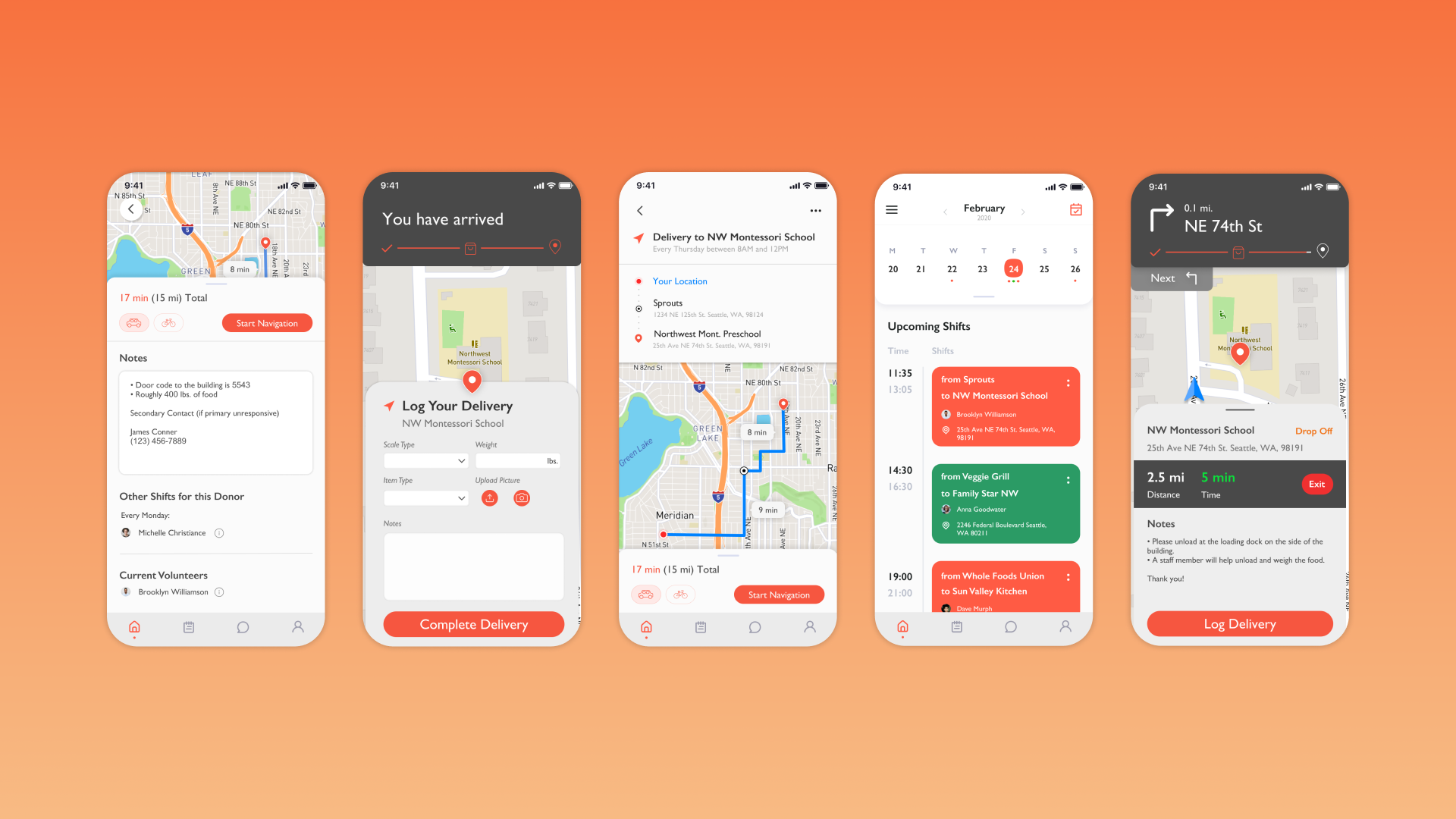
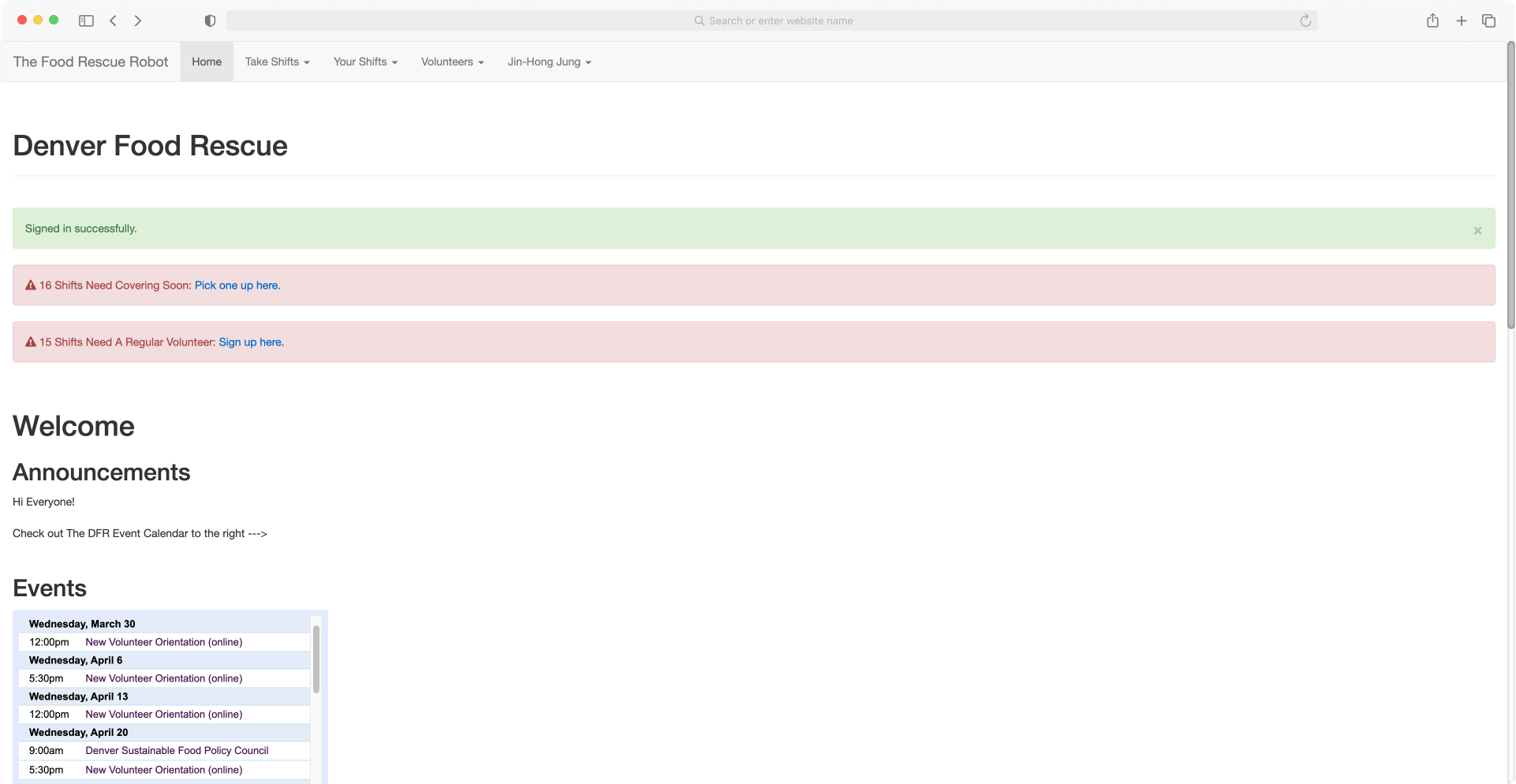
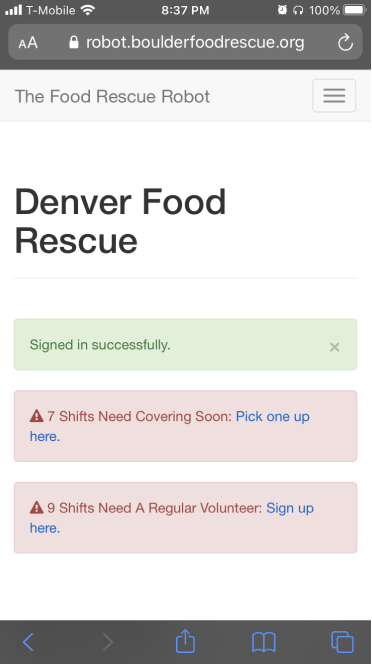
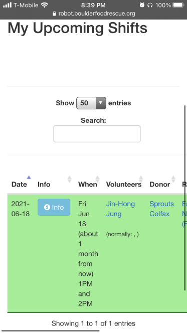
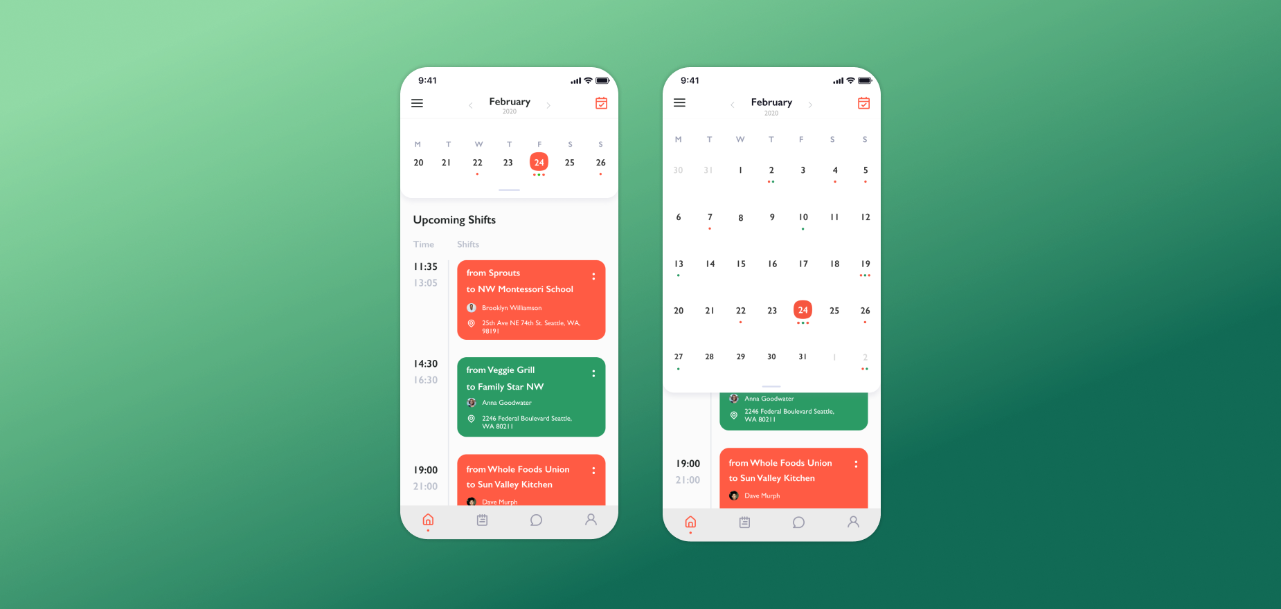
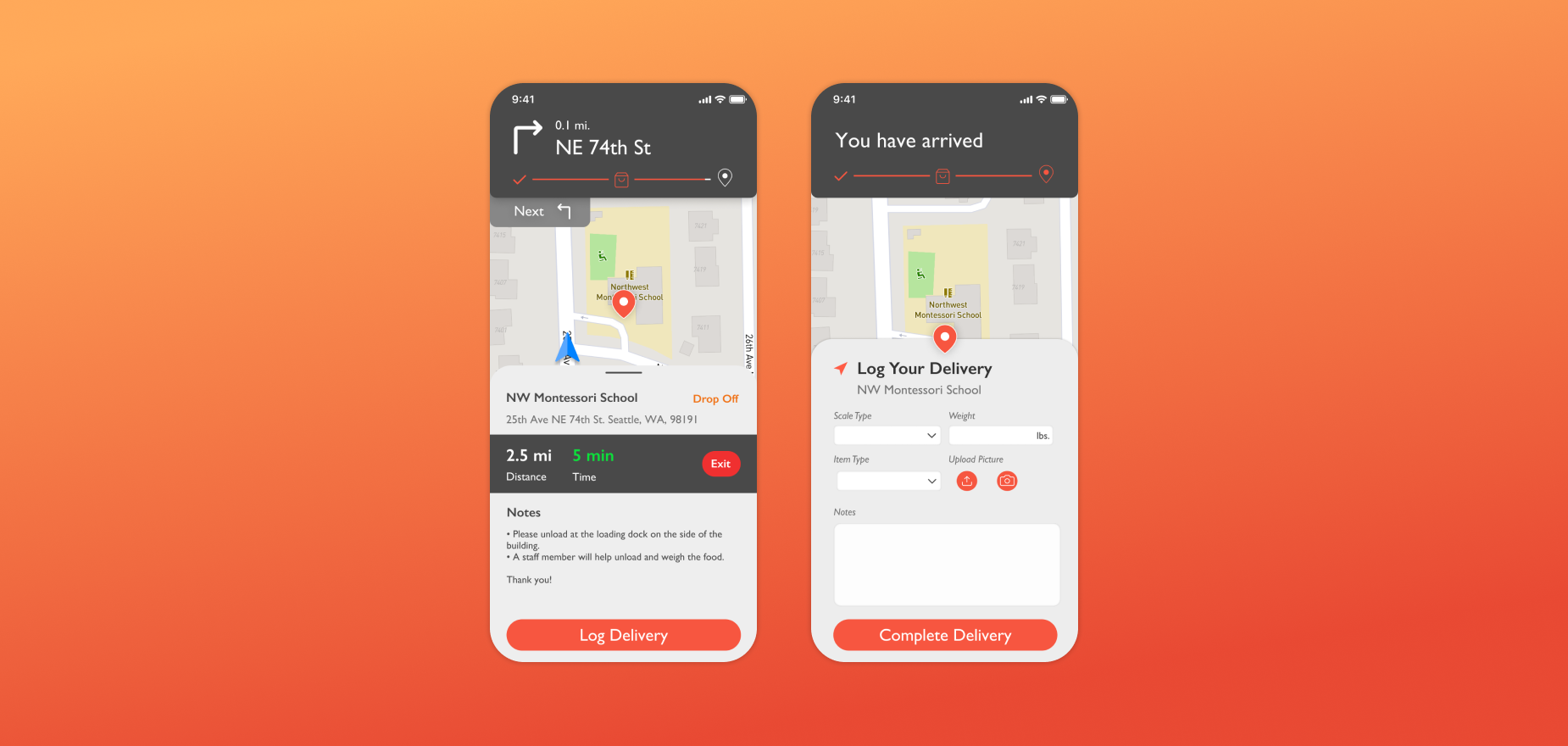
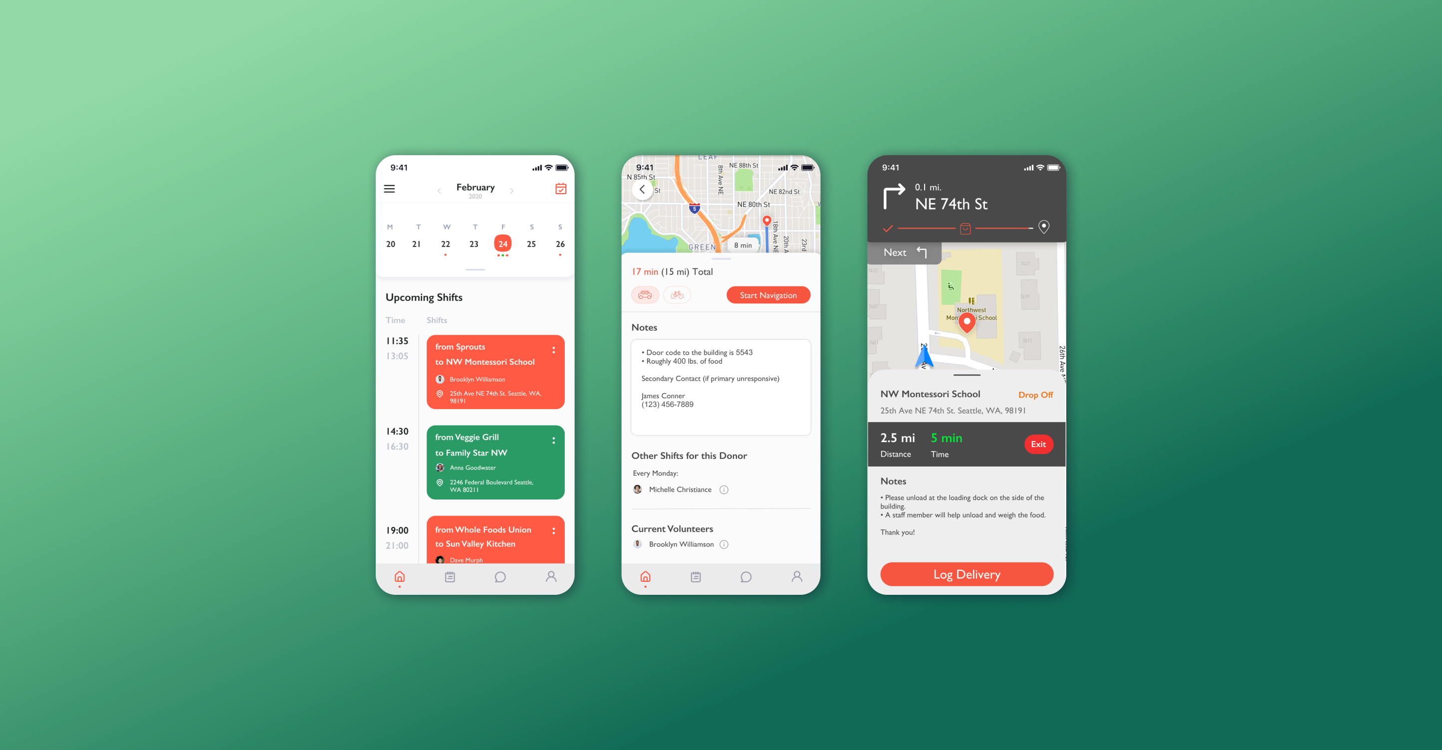
The Food Rescue Robot is a Colorado-based but multi-city scheduling/tracking tool created by a team of volunteers from the Denver Food Rescue to help coordinate the pickup and delivery of food to and from locations. The volunteers need a mobile app that allows them to pick routes and optimize their shift while on the go.
The Food Robot already has a solid backend that supplies volunteers with locations of routes and contact points, but it would be a stretch to call the system “good”, as it lacks clarity and makes it hard to volunteer without existing insider knowledge.
Our task was to package its existing data into a more accessible mobile app that makes it easier for people to volunteer, and for volunteers to optimize their efforts.
I conducted user interviews with stakeholders and current volunteers who access the service regularly to gain a better understanding of my target audience. The following are several key takeaways.
We discovered that it was crucial for drivers to skim through drop-off instructions as they were driving to target locations.
Users also had a difficult time finding the shifts they volunteered for and struggled to view any available shifts posted by other volunteers.
Users find getting off the website to navigate to target locations inconvenient, where they are forced to slow down the process of deliveries. They are often left confused when information is also lost in the process (e.g., when the browser refreshes).
Volunteers mainly enter the website to view their shifts. The current system does not offer that feature when the volunteer logs in.
Viewing shifts is the main reason for using the platform. The current system offers almost the opposite, causing volunteers to read and scroll with more effort.
When delivering and nearing a target location, users were forced to look at their phones and pay a lot of attention to where they needed to arrive. This left volunteers feeling dangerous and unsafe while driving/biking.
Users most often had to return to their desktop computers to log deliveries they have just completed. Sometimes, they even forget to log them down.
Our research findings and insights defined our key design question, which would guide us through the entire process: How might we reduce the number of actions users need to take to navigate to target locations?
Our research findings and insights defined our key design question, which would guide us through the entire process: How might we reduce the number of actions users need to take to navigate
I moved forward by designing mid-fidelity wireframes, focusing on screens that volunteers run into most often.
According to feedback and user tests, our group spotted key elements that can be reiterated when polished to high-fidelity prototypes.
The main idea of the homepage was different from what we imagined. Users preferred a collection of shifts, not an entire calendar.
A CTA wasn't available when this screen was intended to be the most important stage of starting a shift
Driving wasn't the only method of getting to target locations. Users repeatedly wanted to know every step of the navigation experience.
Before fixing the issues that I have encountered, I created a style guide to make every screen a consistent experience and to portray a clear brand that reflects the organization’s mission.
Volunteers can now view their shifts in one central location. They have the option to expand the calendar for a monthly view.
The Food Rescue Robot provides immediate access to important information with one swipe. This creates a seamless and convenient experience when it is time to start their shifts.
Completing deliveries can be done in a matter of seconds, allowing volunteers to move on to their next shift without having to remember completed deliveries.
Volunteers praised the idea and were willing to integrate the look and feel of the designs we presented.
As it was my first time creating a design system from scratch, I was challenged in stretching my knowledge to think systematically, instead of creating new fonts, colors, and elements as the product expanded. There are plenty of things to improve upon in this project since we weren't given enough time for usability tests and iterations upon feedback, but it has been something that our group wishes to accomplish in our future projects.